Words are powerful, but they are not always the best way to communicate. Visual storytelling—the process of conveying ideas through visuals—is a critical skill for UI/UX designers. In an industry driven by user experience, a well-designed visual can clarify complex ideas, making interfaces intuitive and engaging. Yet, many people hesitate to use visuals, fearing they lack artistic talent. The truth? Visual communication is a skill anyone can develop with practice and play.
In this article, we will explore the principles of visual storytelling, why they matter, and how you can improve your designs by applying these concepts.
Understanding Visual Storytelling

Visual storytelling is the practice of using images, typography, color, and layout to communicate messages effectively. It enhances clarity and engagement, helping users quickly absorb information. Whether it’s a simple flowchart or a complex UI dashboard, strong visuals can make the difference between confusion and clarity.
Why Visual Storytelling Matters
- Enhances comprehension: People process images 60,000 times faster than text (source).
- Improves user experience: Well-structured visuals make navigation intuitive (NN Group: The Importance of Visual Hierarchy).
- Increases engagement: Visual content attracts attention and improves retention (HubSpot Visual Content Stats).
Unlearning Design Myths
Many of us were taught to prioritize words over visuals. Early exposure to decorative fonts and excessive styling may have clouded our understanding of good design. It’s time to unlearn outdated practices and embrace visual storytelling as an essential UI/UX skill.
Finding Balance Between Creativity & Usability
- Avoid unnecessary decorative elements.
- Focus on readability and clarity.
- Experiment with design through play (IDEO’s Design Thinking Guide).
Typography: The Foundation of Visual Storytelling
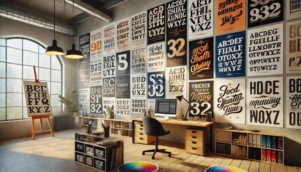
Typography is more than just selecting a font—it’s about structuring text to enhance readability and hierarchy.
Best Practices in Typography
- Stick to one typeface. Using multiple fonts can create visual clutter.
- Leverage font weights and styles. Instead of using different typefaces, vary weight, size, and color.
- Change one thing at a time. Adjusting size, weight, or spacing one step at a time ensures clarity.
[Resources: Talking Type by Jessica Hische, Typography Checklist on Checklist Design]
Key Principles of Effective Visuals
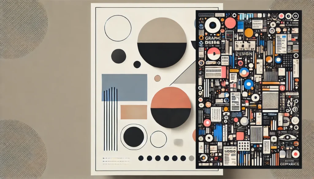
1. Clarity and Focus
Good design ensures that the most critical message stands out. For example, reports should be informative yet easy to scan.
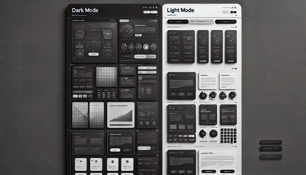
2. Consistency
Using uniform styles and layouts improves usability. Design systems like Google’s Material Design and Apple’s Human Interface Guidelines emphasize consistency.
3. Contrast
Contrast helps distinguish key elements. Use size, color, and weight variations to create emphasis (Adobe Guide on Contrast).
4. Simplicity
Avoid excessive embellishments. The best visuals communicate with minimal distractions (Laws of UX).
5. Hierarchy
Guide user attention by structuring information logically. Headings, subheadings, and whitespace play a vital role.
Practical Applications in UI/UX Design
Scannable Reports & Flowcharts
Infographics and flowcharts help simplify data and processes. Tools like Whimsical and Miro allow easy visualization.
Designing Case Studies
Successful portfolios use visuals to showcase problem-solving processes, making them more engaging than text-heavy case studies.
Process Visualization
Before-and-after diagrams are effective for showing design iterations and improvements.
Tools for Visual Storytelling
- Typography & Layout: Google Fonts, Typewolf
- Prototyping & Design: Figma
- Diagram & Flowcharting: Whimsical, Miro, Mural
- Illustrations & Icons: Humaaans, Apple’s Symbols Set
Developing Visuals Through Iteration & Play
Why Iteration Matters
Iteration is key to refining visual communication. Professional designers go through multiple versions before finalizing a design.
Example: UI Iteration in Figma
A designer may start with simple typography adjustments, then refine layouts, colors, and iconography.
The Role of Feedback
Early feedback ensures that visuals convey the intended message effectively. Testing designs with users improves clarity.
The Role of Color in Visual Storytelling
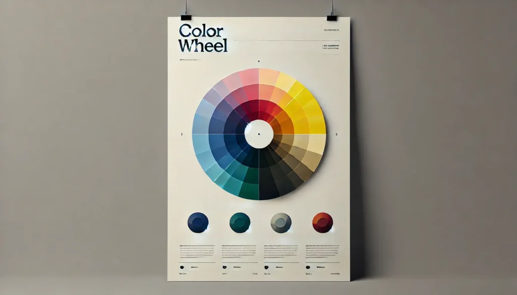
1. Psychological Impact
Different colors evoke different emotions—blue for trust, red for urgency, green for calmness (Canva’s Color Psychology Guide).
2. Functional Use
Color can direct attention and create hierarchy.
3. Best Practices
- Use contrast to highlight key elements.
- Avoid using too many colors in one design.
Bridging the Gap Between Playfulness & Professionalism
Designers must balance creativity with usability. Experimentation helps refine storytelling while maintaining clarity.
Examples of Professional Yet Engaging Designs
- Minimalistic UI dashboards with strategic color use.
- E-commerce pages using strong typography for key messages.
- Infographics summarizing complex reports with visual hierarchy.
What’s Next? Practical Takeaways
- Start Small: Apply these principles in your next UI/UX project.
- Use Existing Tools: Experiment with Figma, Google Sheets, and free resources.
- Seek Feedback: Collaborate with peers for constructive critique.
Conclusion
Mastering visual storytelling enhances UI/UX design, making interfaces more intuitive and engaging. Start by applying typography best practices, focusing on clarity, and iterating through play. With practice, you’ll refine your design intuition and develop a strong visual foundation.
Would you like me to further expand on any sections or provide additional case studies?