Press ESC to close

Editor’s Pick

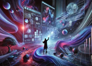
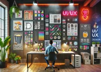
Visual Design Principles: Mastering Visual Storytelling for UI/UX

Words are powerful, but they are not always the best way to communicate. Visual storytelling—the process of conveying ideas through…

- Sponsored Ad -

Trending

UI/UX Trends for 2025 – The Future of Digital Experience

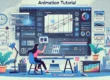
UI/UX design is evolving faster than ever, and 2025 is set to be a game-changer. With AI-driven personalization, immersive AR/VR…

Modern UI/UX wireframe displaying a structured dashboard layout with clear hierarchy, contrast, and alignment. The image showcases both dark mode and light mode variations side by side. The dark mode features deep blacks and subtle grays for a high-contrast look, while the light mode uses soft whites and light grays for a minimalistic feel. The layout includes a left-side navigation bar, a top bar for user interactions, and a main content area with cards and sections, all with smooth, rounded corners and well-spaced modern typography.
A futuristic style illustration featuring the professionals of the 3 different areas working together to build a futuristic high tech product.
Here Are 8 Ways To Success Faster

The European languages are members of the same family. Their separate existence is a myth. For science, music, sport, etc,…

An illustration of an animation tutorial in Figma, showing a designer working on keyframes and motion effects in a modern digital workspace.

Inspiration

Latest Posts

Brand presentation and mobile app mockup of the Beergate Portal App
UI/UX Project: Beergate Portal Concept Design (WIP)

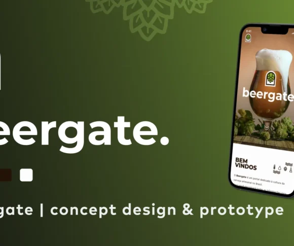
The team, Flying Collective, was contacted by a group of investors from Sao Paulo -…

Modern UI/UX wireframe displaying a structured dashboard layout with clear hierarchy, contrast, and alignment. The image showcases both dark mode and light mode variations side by side. The dark mode features deep blacks and subtle grays for a high-contrast look, while the light mode uses soft whites and light grays for a minimalistic feel. The layout includes a left-side navigation bar, a top bar for user interactions, and a main content area with cards and sections, all with smooth, rounded corners and well-spaced modern typography.
7 Proven UI Design Principles to Enhance Usability and Engagement

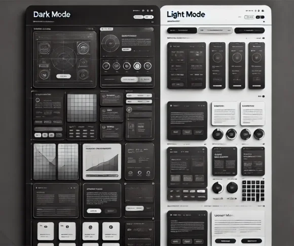
Good UI design goes unnoticed; bad UI design frustrates users and drives them away. A…

1980s-style illustration of a boy sitting in his desk interacting with different old school user Interfaces like an old classic computer, a television, and interactive charts
What is Human-Computer Interaction (HCI)? A Guide for UI/UX Designers

It’s hard to imagine a time when computers were intimidating, complex machines that required a…

Illustration showcasing various Gestalt principles in design, including proximity, similarity, closure, continuity, figure-ground, and common fate. Each principle is represented using simple geometric shapes, lines, and patterns in a modern, minimalistic layout with a neutral color palette, clearly demonstrating how these principles influence visual perception.
Gestalt Principles in UI Design to Improve Usability

Have you ever looked at the sky and noticed a cloud shaped like an animal…

logo

Hello, We’re content writer who is fascinated by content fashion, celebrity and lifestyle. We helps clients bring the right content to the right people.

- Sponsored Ad - Advertisement